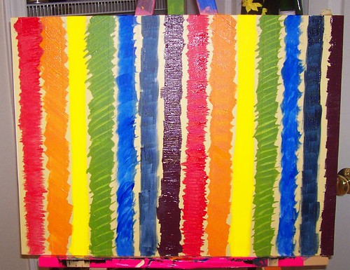
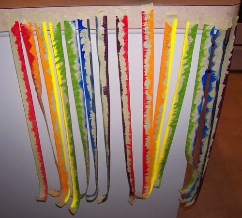
And then I pulled off the masking tape (Which strangely? I can't throw away. It's like a little happiness on my counter when I walk in the house.):
Then, here's the final picture:
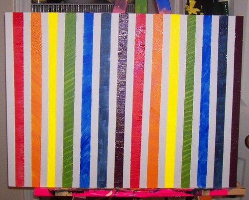
But I think I want to turn it like this.
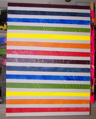
But I'm also not sure I'm done. What do you think? Do I need to do something more to this painting?
Yes, YOU, internet, YOU can have input on the fabulous work of art* that I'm creating.
*Inasmuch as "art" is some paint slapped on a canvas because I'm bored and inspired. But c'mon! It's fun! Don't you see all the different textures that I've made in the different colors?


15 comments:
Delurking here to add my two cents... have been reading your blog for a while.. what about adding a little non linear aspects to it... perhaps some contrasting paint blobs ala Jackson Pollack? Just a thought...
Funny...I liked the first blotchy one the best! HA!
I like the simplicity of how you currently have it. You could always have the frame create the "something extra" you're looking for.
I love it! It looks great. I say keep it and continue creating while you have the juices flowing. You can always come back and change it later if you are dis-satisfied.
It's lovely! But I love the idea of a black and white photo somehow superimposed on the front... just don't ask me how! LOL x
OK.
You need to make PASTE PAPER.
It's an awesome way to create pretty paper with pretty patterns in paint, very much like what you did on your canvas here :)
Google "pastepapers" and see what you find--I'm sure you can get a step-by-step. But you could totally wallpaper your place in gorgeous homemade patterns.
I love it with the strips vertical.
I like the horizontal stripes. Be careful you don't do a whole lot to it. ... I've been painting lately, too: http://denver.yourhub.com/PARKER/Blogs/Arts-Entertainment/Art/Blog~132441.aspx
Thanks for the read.
I wonder if you could slit the painting a bit) in order to weave the masking tape happiness through. It would add even more texture, and could be as random (or ordered) as you want. PLUS, if it looks like crap, you could remove the woven pieces and repair the canvas.
I think that you should go easy on either the colors or the textures. So, in order to unify, I think you should poor a whole lot of dripy red paint on it. No, seriously.
First, wait for the paint to dry, then tape over the painted parts. Then do more of the same in the white spots (except for contrast use some muted tone, or black and white, pen and ink, or something very detailed and sophisticated).
dude, seriously. I would buy that off of you. I am not making this up. LOVE IT. Can you do one in more pink?
an ar-teest, you are...
I think it should be called "The Biv Twins." And it's spectacular.
Wow. Looks amazing. Way to go! I especially like the green lines with the diagonals.
I know very little about art, but I think Angela has a good idea. So does the queen, though. I also think it looks rather fine the way it is.
Glad to hear you'll be doing more.
It is done when YOU say it's done.
I, for one, think it is fab. The different textures completely grabbed me.
And the tape?
I couldn't have thrown those out either.
I totally get you.
Post a Comment